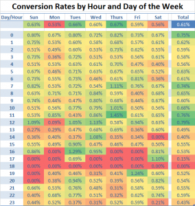
Visualize Your Best Converting Hour & Day of the Week
Update 5th January 2013: I’ve made this approach a little easier, faster and more accessible for your average Joe. Thanks to Dries Bultynck, Adrian, Wenting and Jordan for encouraging me to fix this up.
Enjoy, folks!
Last week, Tim Leighton-Boyce shared a post about day-of-the-week reporting in Google Analytics V5. It reminded me of a cool little visualization Core Metrics uses to illustrate the best converting hour and day of the week, as well as how to construct it in Microsoft Excel.
Yes. It’s really that simple to do, and gives you a visual indication of predicting sales and email sweet spots, and when to increase the PPC budgets.
Here’s the unbelievably simple way to make it happen…
Getting the data
First of all, you’ll need Google Analytics, Excel 2007 (or later) and a LOT of data. ‘How much data, Rob?’ you say? Well, in the above example, I used a sample of 300,000 visits. ‘Ooh…that much.’ should be your response.
Anyway, once you’ve got that little bit sorted, here’s your next step.
- Load up this Google Analytics custom report I built for the job (Hour & Day of the Week)
- Apply any segments you need and select a date range that includes full weeks with LOTS of data
- Export the days of the week report into Excel or CSV format - keep in mind you need to update the number of rows on the report (see the little drop down beneath the data table)
- Open it up in Excel 2007+
- Remove the “Totals” row at the bottom of the data
- Select the data and create a pivot table in a new spreadsheet
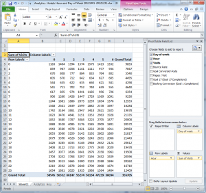
- Put “Hour” in the rows and “Day of Week” as the columns (show example)
- Place whichever metric you like in the values area
- Copy the table and paste the “Values only” into another spreadsheet
Creating the visualization
Then format it as a table to make it more readable.
Voila, you’re done.
It can just as easily be applied to other metrics, like ROI, revenue per visit, average order value, bounce rates and every other buzz metric you have to report for your own purposes, or for clients who require buzz metrics.
Hopefully this visualization gets you thinking about the needs of your visitors at particular times of the day and week. If not, then I probably need to work on my conversion skills, too.
Notes
Important: If you want to see accurate conversion rate totals, you will first want to create a pivot table for visits, and a second table for sales/bounces/goals/revenue. From this point, you will be able to calculate a conversion rate by dividing the goals table by the visits table. This will give you more accurate totals, rather than an average generated off the rates Excel sees.
Alternative way to visualise the data - Show it along a single axis like this:
A format useful for charting multiple metrics alongside one another. Trust me, it looks better when done in Excel.
To do this, simply put both “Day of week” and “Hour” into the Row’s of the pivot table. See this example for more details. And format the data like this before you chart it as a line chart.
Need a hand?
Let me know in the comments and I will help you out.


I really like that! And thank you for the mention.
It occurs to me that it might be good to experiment with other metrics as well as conversion rate. The snag with conversion is that a few sales in the early hours of the morning (for example) could give the wrong impression.
It might be worthwhile considering simple revenue, for example.
I’d also be tempted to filter the information. You refer to applying ‘any segments you need’. I’d certainly experiment with data which excludes sources like your existing email visits in order to get an idea of what people would ordinarily do.
There’s so many things you could do with this technique! There seem to be endless possibilities.
This is more than awesome.
I just ran this for my all-time AdWords data (as it is one of few variables I can really control) and the info is very clear as to what we should do - now if only the client can understand!
(around here we have a saying “I can explain it to you, but I cannot comprehend it for you” and unfortunately this applies occasionally…)
As for any shortcuts, how do you end up collecting this data without clicking a million times on Analytics to get the data sorted right, etc etc?? (click once to get the day of the week by hour, click to sort, click to get more than 10 on the page, then export, then back-key a bunch of times to get back to day of the week, and then rinse and repeat 7 times…)
there’s got to be a way to do some kind of macros with the new GA.
Meanwhile, awesome job done by the Optimisation Beacon folks!!
@Tim - Thanks for your kind words - Simple graphs like these can be quite useful… Good point about the wee hours of the day - luckily there were no spikes in my data. That said, if there ever were, I’d love to see revenue graphed. Per visit value could also be good - if you have the data that is.
@Anon - Thanks, I’m glad you liked it. Truth be told, I wish there was a shortcut! Unfortunately I did it all manually in GA V5. Hopefully this graph shows your client exactly what they need from you. Perhaps you could do two - one showing the current state and a second showing the ideal state and what that means in dollar figures for them.
Actually, regarding a shortcut - there surely must be a way to do it in Excel using Excellent Analytics. Would love to hear if anyone can put a solution together…
thanks for this Rob!
what actions did you take out of the insights you got from the highest and lowest conversion rates by hour and by day?
did you for example, change your marketing plans to focus on certain times of day etc.
and i think you should also take into account the no. of visits by hour as well, because just looking at conversion rates alone would skew the picture, (if say i had very few visits my conv rates would look awesome)
Thank you, Lydia.
One of the insights I took away from this is that you could run more appealing offers when conversion rates are low and ease back on offers when conversion rates are higher (that way, you can ride a wave of extra revenue coming into the site).
There are some caveats to this - just like you and Tim mentioned. Conversion rates can change dramatically when data is lean. Also, some of the peaks may correspond with email marketing or day parting in SEM campaigns. Always a good idea to be aware of how that may affect the metrics. One thing you may like to consider is using bounce rates or pages/visit instead.
Either way, tonnes of data will usually smooth peaks out.
thanks Rob. that’s true about the sem campaigns and edms. i’m going to check when we blast out those edms. hmm.
by the way i’ve just finished the analysis for our website using this method. keep you posted if we see any results!
oh, and i’ve started following you on twitter.
cheers
What a great Chart…Really Useful
Searchengineman
This is a really useful chart with some great instructions. I love how deep you can delve with the data you get from PPC campaigns to really optimise your campaign. I’ll definitely be using this on some of my accounts and see what I can find!
Cheers
This is great, from one stats junky to another! That’s the beauty of the web and new media *almost* everything is trackable!
Hi Rob,
Looks awesome - for some reason I can’t load your custom report. Are you able to detail the metrics and dimensions you used so I can build it myself?
Thanks
Hi Adrian, I can do you one better.
I have a Google Docs spreadsheet that automates it through the Analytics API. I’ll post this up by the end of the week.
Unfortunately there is nothing I can do about the custom reports - Analytics seemed to stop supporting them for some reason. Not sure why exactly.
Hi Robert,
Thanks for posting this - I too will find this report invaluable. Glad to see Adrian’s post here and realize that I’m not alone in my inability to load a custom report. I’ll check back for that Google Docs spreadsheet later this week. Thanks!
Hi guys,
Have just posted the automated method through Google Docs over here:
http://www.optimisationbeacon.com/analytics/build-a-conversion-rate-heatmap-by-hour-day-of-week-in-google-docs/
Anyway, let me know how you go with it. Should be a bunch faster for you too.
Hey Jordan and Adrian, I’ve updated this post to work now. Enjoy!
Thanks a lot for your article, we have follow all your steps but I founding some problems with the pivote Table which is adding the days of the week and showing them in cols instead of rows.
Any help would be appreciate.
Thanks a lot again.
Iñaki
Hey Iñaki,
Does your pivot table look like this: http://www.optimisationbeacon.com/analytics/visualize-your-conversion-rate-by-hour-day-of-the-week/attachment/excel-pivot-table/
Try dragging and dropping the fields above into the areas below - don’t worry about clicking the tick boxes or dragging and dropping the fields onto the report.
Let me know how you go.
So, I hate to admit it, but I am struggling with this. I’d love it if you could post a video of you doing this. Basically, I get through the first 9 steps just fine, but then I am lost on the creating the visualization part.
I loved the old google docs version - too bad they changed their API.
K
Hi Kristen,
Sorry, I haven’t had time to re-up a video unfortunately. You’re probably wondering how to paste the “Values only”. Try selecting the pivot table, copying it and when you paste it into a new spreadsheet, press “Ctrl+Alt+V” rather than “Ctrl+V”. Here’s what to select on the “Paste Special” dialogue that shows up:
http://www.optimisationbeacon.com/analytics/visualize-your-conversion-rate-by-hour-day-of-the-week/attachment/paste-special/
Alternatively, there’s a longer way to do it: http://office.microsoft.com/en-us/excel-help/use-paste-special-to-insert-static-or-linked-data-into-excel-HP001108276.aspx
Hi Robert,
I’m new in analytics so this info is very very helpful!! Since I’m not an excel pro either.. I have a question:
I’m fine until step 9 I’m trying to use your template, but I want to know how did you get the percentages? Do you need to show the values as a % of the grand total, or % of row/column total?
Cause I just get numbers (from the analytics results like you did on the Pivottable
This is driving me crazy and I can’t find an explanation
Thanks!
Hi Samantha,
I wouldn’t recommend using % of grand total or % of row/column total - The best way to get percentages is to do the following:
- Create a pivot table with “Sum of Visits” in the values
- Copy these values to another tab (using values only as I described to Kristen, above)
- Create another pivot table with “Sum of Goal Conversions” or “Sum of Transactions”
- Copy these values and paste them near the values for visits
- Divide the Goals table by the visits table and viola - you’ll have percentages
- Simply format them as percentages using Excel’s “percentage formatting” button: http://office.microsoft.com/en-001/excel-help/display-numbers-as-percentages-HP001216508.aspx
Hope that helps, Samantha. Let me know if that makes it a little clearer.